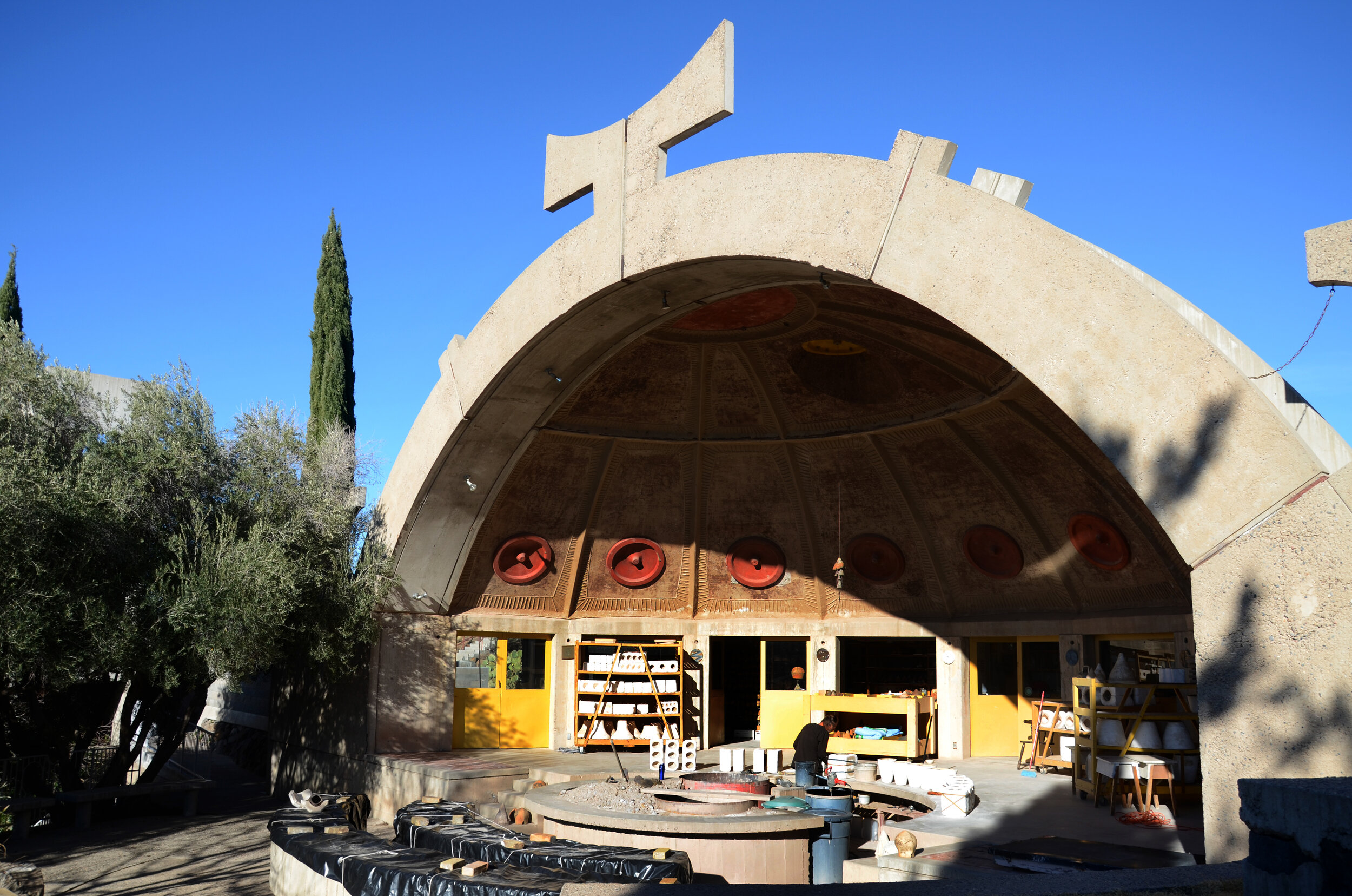
Arcosanti by hugo keene

Location: Yavapai County, Arizona, USA
Architect: Paolo Soleri
Construction: 1970 - Ongoing

16 Photographs

I don’t usually post consecutive buildings from the same trip, no less two buildings separated by so little time and distance, but for some reason this seems to have happened and I’m going to roll with it. I was first introduced to Arcosanti, by my other influential tutor and friend, Sean Pickersgill, a few years into my architectural education.

I’ve always been fascinated by the concept of Arcosanti and in finding ourselves travelling through the deserts of Arizona, Utah and New Mexico, it was an obvious choice along the way. It’s an extraordinary place, utopian in it’s vision and proposed scale, and while that scale is yet to be realised, the experimental nature of it is still incredible. An experimental city in the desert, Soleri’s vision was originally for a vast sprawling city rolling down into the valley in which it is situated and (eventually) creeping out the sides into the desert. While the extend of that city is yet to be realised (and may never be), there is enough there to see what was in his minds eye. It has echoes of the hill towns of his native Italy in the narrow tall streets, well suited to the hot climate, with the platforms and open squares scattered throughout, with big roofs over other public spaces, providing a variety of different urban conditions interlaced with living, work and play.

The handmade, unplanned, and experimental nature of the construction techniques means that the details woven during the process means that there are layers and layers of richness embedded into each part of every building. The unpretentious rough nature of the buildings means that the residents have been able to adapt and personalise the spaces in a way which reflects the organic nature of their existence, both human and urban.

We were lucky enough to be able to stay here for a couple of nights and to have essentially free run of the place day and night. This led to some extraordinary games of light painting, which will perhaps be posted at a later date.

The buildings of Arcosanti sit so comfortably in the landscape, hewn from the very earth on which they are built, in a similar but different way to Taliesin West. It really is something else, unlike anything I’ve ever seen and unlikely to ever see again.

HWLK

2021-2022 - Reflect and Progress by hugo keene

As we move from 2021 into 2022 it's time to reflect on last year and give thought to the progress in front of us this year.

Architectural projects usually span from one year to the next so while this matrix image is filled with work and images from 2021, mostly they represent projects and ideas we intend to move forward and realise in 2022. We're very thankful for all our collaborators who share their time with us and for all our clients who put their trust in us.

Here's to a grand 2022, may it be reflective and progressive.

HWLK

Taliesin West by hugo keene

Location: Scottsdale, Arizona, USA
Architect: Frank Lloyd Wright
Completed: 1937

12 Photographs

One thing that I found striking about the southwestern USA, was how familiar it felt. It makes perfect sense, given the similarities in climate between the American desert and the place where we grew up on the edge of a desert in Australia, but it wasn’t just the warm dry air and the expanses of sand. What also felt familiar was the landscape, in particular the plants, which have evolved to cope with the harsh dry desert conditions, protecting themselves from the sun, heat, and drought, striking against the raw redness of the dust, dirt and rocks. Our grandmother was a renowned collector of cacti and succulents, so we grew up surrounded by these kinds of plants.

I felt a similar level of familiarity with the architecture of Taliesin West. I’ll be honest and say that I didn’t know the building well before we visited. I’ve never studied FLW at length and while it is one of the most prominent of Frank Lloyd Wrights works, he built so much that I just never looked too hard at any individual projects.

What is clear, is how much this his thinking has influenced generations to come. It is most evident in some of the case study houses, but also works further afield, from Australia to London. This building made me think of the early work of Samuel Mockbee and the Rural Studio in Alabama, raw, immediate, and utilitarian, definitively buildings of spirit. It also reminded me of the work and spirit of my old friend and teacher, David Morris at the Louis Laybourne Smith School of Architecture and of a lot of the architects who have influenced me from back home. In this, it seems the influence of the work extends beyond the landscape in which it is set.

I found it to be a very powerful and evocative architecture, at times almost spiritual. It is literally and figuratively both embedded in and crafted from the earth on which it sits. Splendid stuff.

HWLK

Couvent Sainte Marie de La Tourette by hugo keene

Location: Éveux-sur-l'Arbresle, Rhône-Alpes, France
Architect: Le Corbusier & Iannis Xenakis
Completed: 1953 - 1961

22 Photographs

Of all the buildings I have written about so far, none have been harder to write something meaningful about than this one. Even harder still were my attempts to convey a building like this in a limited number of photographs. The long list was 95, the shortlist was still 47 and the final selection still feels like it leaves out almost everything. There is so much richness and interest to this building, that one can only visit it to really understand it. In that way, I am reminded of Corbusier’s other seminal work, the chapel in Ronchamp, one of the central modernist buildings from which today’s sinuous buildings have evolved. Compared to Ronchamp though, La Tourette is something altogether different. It is an incredibly rigorous building, vast in its scope and ambition, a courtyard building evolved around the programmatic order of the priory and the monastic tradition.

It’s a building which you might easily dismiss from afar as a severe and unforgiving structure, cold and imposing on the hill like a concrete sentinel, but inside the playfulness and rich complexity of form and plan, interposed with bright programmatic use of colour, makes for beautifully lit warm and compassionate spaces. The unusual design collaboration with musician Iannis Xenakis is evidenced in the rhythm of the windows in the façade, which relate both internally to the spaces and externally to the massing, giving the building a kind of pulsating rhythm that echoes throughout the place.

A lot of the time, when I travel on architectural adventures, it’s a whistle-stop tour of electric pace. There are always a million things to see and not every building is well understood or researched in advance, some are just names or coordinates on a long-forgotten map, but some buildings you do know well, having studied them at length at university or since. With Corbusier, they always feel like the former and not the latter, no matter how well you think you know them. I have several books on La Tourette and have admired it as a masterwork for as long as I can remember, but visiting it was reminded of how little I really understood it at all and I felt like a green student again. It’s a terrible way to write about a building, to state outright that it feels pointless to try to describe it, but if there is a central theme to my writing about photographing buildings, it’s probably about the importance of visiting them to understand them. I can’t think of a better example of this than La Tourette. Like discovering that a lifelong friend has a previously unbeknownst fascinating side to them, or that they are someone else completely beneath the façade. Buildings, at least the good ones, are almost always like that. It takes a long time and a lot of practice to read space from afar, or from drawings, and I’m not ashamed to say that sometimes I don’t feel very good at it.

Visiting buildings multiple times is something which doesn’t happen too often. There are a few places I have gone again and again. Sometimes I visit somewhere, and I end up returning to show someone else, maybe my brother, or a group of students, or I just happen to be passing by, but occasionally simply visiting once just is not enough and you yearn to return. Therme Vals springs to mind immediately, the Mariendom Neviges as well, and La Tourette is another. Of all the wonders of the oeuvre of Le Corbusier, this one has always fascinated me the most and I walked away from it vowing to return. Like a lot of these journeys, they happen on the way to somewhere else, and for obvious reasons, I haven’t been ‘on the way somewhere else’ in quite some time, so I haven’t been back yet but hopefully, in the not-too-distant future, I will. It might be some time before that happens, but when I do, I’ll plan to stay the night in one of the cells and explore a little more on my own terms.

I have loved going through the process of editing all my old photos and reliving the experiences of visiting the buildings. I have tried to unlock and understand the buildings and the visits at an arm’s length, and it’s been a rich and rewarding experience, almost like traveling, just without the hassle and significantly cheaper.

HWLK

Sydney Opera House by hugo keene

Location: Bennelong Point , Sydney, Australia
Architect: Jørn Utzon
Constructed: 1959 - 1973

14 Photographs

Every time I visit Sydney, I take a walk down to Bennelong Point and the Sydney Opera House and each time, I marvel at the unique vision and circumstances that gave rise to what is perhaps the most recognisable building in the world. It’s known as just the Opera House back home, a building at the heart of a nation, similar in stature to some of its other greatest natural treasures, like Uluru, the Great Barrier Reef, the kangaroo, and a myriad of others.

I do not recall my first encounter with the shells of the Opera House but it must have been as a child on one of my first visits to Sydney. It’s so ubiquitous in Australian culture and media, that it just feels like it’s always been there. I recall Glenn Murcutt once explaining that great buildings are in a way, obvious, or inevitable, in that they respond to their context with an innate sense of belonging, like they were made for the place, and similarly the place for it. I personally cannot think of a building which is more obvious in this way, or better reflects what Glenn was trying to convey than the Opera House.

It is a remarkable building, even more so when you understand the tumultuous road that it took to completion. I tried to include more photos of the interior than the outside, as perhaps it is a side of the building not seen by most before, but one equally incredible in its resolution and vision, despite its torturous history. The scale and articulation of the geometry and form of the concrete shells is something that would be envied even in today’s world of design, assisted as we are now, by the power of computing. It’s even more remarkable to think that the whole thing was not only built without the aid of a computer, but designed by Utzon from a world away, without having ever visited the site.

A few years ago, I was in Sydney for a few weeks and was lucky enough to be staying near a ferry stop, so every day, was able to commute into Sydney on the ferry, passing by the white shells twice a day in all sorts of conditions and experiencing them, and the harbour, as those fortunate enough to live here do. I’ve always loved the building and wondered whether those who see it every day continue to marvel at it in the way I have over a lifetime.

I won’t try to list the intersecting reverberations that have spread like bouncing ripples through the world of architectural thought by this simple beautiful building, but instead, I will try to tell the same story through a simple analogy. If you know the complex topography of Sydney Harbour (if you don’t then perhaps take a look at it on Google Maps), then I might ask you to imagine how a giant stone thrown in the middle might cause a never-ending pattern of similarly intersecting ripples that would bounce off the edges and crash together as they continuously move around the inlets and bays formed by the millennia of geology and weather. To me, the influence of Utzon’s masterpiece seems something like this.

Each time I see a new cultural centrepiece building perched proudly in the middle of an ambitious cityscape, I can’t help but compare it to the Opera House, but I have to say I am yet to discover one which feels quite so suitable.

HWLK

Bruder Klaus Feldkapelle by hugo keene

Location: Mechernich, North Rhine-Westphalia, Germany
Architect: Peter Zumthor
Completed: 2007

16 Photographs

When I discovered that our travel route would come near this little field chapel, I confess that I was just a little excited about the prospect of seeing it in the flesh. Probably the smallest building I have visited, and one of the most memorable. It’s a simple timeless primitive little building, squeezed into a narrow slice of buffer land between large swathes of agricultural land. Easy to miss if you’re not looking for it, but impossible to forget.

I love this building so much, I visited it twice within the space of 24 hours. We had arrived at the site late in the day one afternoon and enjoyed the brief time we’d spent there. It was clear then, that the building would feel vastly different closer to the sunrise, so we (I) made the decision to backtrack the following morning and return to the little chapel for another go.

On the two occasions we visited, we approached the structure first from the back (the wrong way?) and the following day, from the front (the right way?), and then returning back along a series of alternative routes, so we saw and watched the building from four unique angles. One of the most intriguing aspects this revealed is the way the long narrow plan means that the tower profile changes as you move around it, at first appearing flat and squat, from the sides when viewed at a distance, before becoming almost impossibly slender when viewed from the front or the back, the only way you can approach the building up close. In doing so, it plays a game with scale, reducing the relative scale of the structure, by adjusting and controlling your perception of it. It is very clever.

The way the concrete is cast, it literally feels like it is hewn from the very earth it sits on. It is the rawest concrete structure I have ever seen outside of a farmyard. The texture and layering of it looks and feels more like rammed earth, or some of the more undulating textures of the work of Tadao Ando at Chichu. It feels at once immediate, agrarian, and utilitarian, while at the same time beautifully crafted. There is a considered roughness to nearly everything, put into distinct contrast by the fineness of the finishing details. As the effect of its production on the climate is now understood, today we have a more complicated relationship with traditional concrete, yet it has always been a construction material that has fascinated me with its enormous potential. I feel like this modest little chapel is a grand example of concrete at its finest.

Inside, it has the feeling of a simple primitive place for reflection and, if you’re that way inclined, prayer. I have always loved to drop into little churches and chapels along the way wherever they pop out along the roadside, and this felt similar in that way. If it were not for the buzz of similarly inclined travelers such as myself hovering in and out and breaking the calm, it could easily be forgotten that this is a masterpiece drawing visitors from far and wide.

HWLK

Tančící dům - Dancing House by hugo keene

Location: Prague, Bohemia, Czech Republic
Architect: Frank Gehry & Vlado Milunić
Construction: 1992-1996

10 Photographs

On my first visit to Europe since I had begun studying architecture, I was hankering for my first real architectural adventure outside of Australia, and desperate to see at least one building I had seen during my studies and loved. We were going nowhere near the Neue Staatsgalerie or anything else that I knew well, but I knew of the work of Gehry from the definitive Guggenheim in Bilbao, but had also loved this whimsical little corner building he had done, that I had seen somewhere along the way and we had a fortuitous stopover with enough time to get into the city from the airport, have a wander and then get on our connecting flight. I felt confident enough in my skills at finding things that I set off with two brothers in tow, through the streets of this classical city looking for an architectural marvel. With nothing but a paper map to guide us, which didn’t even have the location of the building on it, we spent a whole day searching the city for this building. I had no idea what it was actually called or where in the city it was, just an abundance of overconfidence, a vivid memory of the building and the way it sat in the city, and a hunch that it was near a bridge of some sort, possibly a river. The story of that day has a few twists and turns, but it is not the story of the Dancing House in Prague, because we were in fact in Vienna, Austria, and I had got the location wrong by 300 odd kilometres.

In my defence, at the time, there were few ArchDaily or Dezeen type websites to peruse for architectural inspiration and research buildings and their locations. Instead, you might have seen a photograph in a book, a magazine, or on a wall in a studio crit somewhere along the way and then you find yourself in the city and off you go looking for it. There remains to this day no listing for the Dancing House on the only architectural website around at that time, Great Buildings Online.

I love the story of my first journey to seek out the Dancing House, (or Tančící dům or Fred and Ginger, or any of the other myriad of nicknames given to the Nationale-Nederlanden building over the years). It was a proper unguided adventure, of the sort we seldom have these days, it was with two of my brothers and it didn’t involve much of Gehry’s architecture. The actual visit to Prague, some years later, was much less interesting from a storytelling perspective. I can’t quite remember why exactly I was in Prague; I was probably taking the long way home from an ice hockey tournament of some sort. I had done some research this time, into the location and city of the building, I had secured a ticket to a tour of the building, and I was on my way. The actual visit was a little underwhelming. We couldn’t view the whole building, as is often the case with working buildings, and the group was too large for the tight little spaces, so you couldn’t really get a sense of the place as it ought to be.

As an architecture student, I was blown away by the sinuous work of Gehry, who seemingly was able to make buildings do things no-one else could and I have seen a bunch of his projects along the way. While I am an admirer of some of his buildings, I find others less powerful, but this building if the former, not the latter, despite its faults. I love the way it seemingly wraps around the corner, cloaking it with its eccentric façade, that despite its unconventional rhythm, keys into the historic fabric beside it.

To me, the building sits comfortably with a different kind of sensibility, more like the respect you have for a peer, than deference or imitation of an elder. It was one of my early lessons in context, learning how the rhythms of architecture and urbanism, are very often undercurrents, masked by what might pass for ‘style’. It was obvious to me that Gehry had harnessed these currents to extraordinary effect in this instance.

It is an odd building in many ways, especially inside, but the Dancing House is important to me as it sparked a realisation about architecture as a contextual response. As a post-modern resident of a classic city, it rightly has more than its fair share of critics, but if we believe, as architects, in an architecture of progress, then the boldness of the Dancing House is essential.

HWLK

Sagrada Familia by hugo keene

Location: Barcelona, Catalonia, Spain
Architect: Antoni Gaudí
Completed: 1882 - Ongoing

12 Photographs

“There is no reason to regret that I cannot finish the church. I will grow old but others will come after me. What must always be conserved is the spirit of the work, but its life has to depend on the generations it is handed down to and with whom it lives and is incarnated.” – AG (the OG)

Architectural history has a kind of progressive order, or neatness, to it. You can usually trace the overlapping strands of building technology and style across the ages, like mapping a river system. Architects and buildings fit somewhere along the map, usually with recent forebearers, and the successful ones usually have future generations following neatly after. Antoní Gaudi has never really fitted into this pattern. His architectural precedents were primarily from the natural world, and his architectural descendants followed mostly almost a century behind. Of contemporaries, he had few, true peers none.

The Basílica Temple Expiatori de la Sagrada Família is not just Gaudi’s masterwork, it is in some ways the masterwork. In the tradition of European cathedrals that took centuries to build, it is perhaps the last of its kind. I have never claimed to be an architectural historian or critic of any kind, but it seems to my untutored eye, to be the culmination of more than a thousand years of religious building tradition.

Along with the other architectural classic resident of the Catalan capital, Ludwig Mies van der Rohe’s ‘Barcelona Pavilion’, this was one of the first buildings I visited in Europe after studying architecture. The main purpose of the trip to Barcelona was to see these two buildings and to experience this legendary city, about which I knew little of substance beyond the architectural highlights.

That first time that I walked through the streets of Barcelona to visit the Sagrada Familia, I recall an overwhelming sense of excitement about what was to come. I have always loved construction sites and this was the most famous of them all. An extraordinary building being built under extraordinary circumstances. While much of the façade and its celebrated stone friezes were in place, the main hall was full of scaffolding, few of the windows were in and it was hard to get a sense of the space. While the genius and grandeur were undeniable, wandering up and down what was something of a skeleton at the time, you had to close your eyes and get a glimpse of this thing that was to come. I noted to myself to return at intervals over the years and watch construction progress unfold.

The building story is as fascinating as the architecture and it has been controversial for almost as long a time as it has been under construction. Much has been said over the years, since the restarting of construction, about the necessary compromise and inevitable dilution of Gaudi’s vision, but I am rather less bothered by all this, feeling like Gaudi knew enough to know that it would not be entirely his and his alone. To me, it is a unique building, unparalleled in its richness of detail and grandeur, most of which is impossible to replicate in photos, much less my own.

I have been to Barcelona several times since and it is a city that has changed a lot over the years with all the tick-tack and artificial life that goes with an influx of mass tourism, and no part has been more over-run than the stairways, floors and spires of the unfinished masterpiece in the Eixample, once on the outskirts of town.

Each time I return to Barcelona, there is always something to enjoy, a previously undiscovered gem of some delight or another, a sample of one or two of the many things about Barcelona which are unique and wonderful, or just another trip down to the construction site to check on progress.

HWLK